


|
|
|
|
|
Viewer Favorites Check out a gallery of favorite blog images as voted by readers. Select favorites using the "vote" button under photos in the posts below.
|
|


Category: For Photographers | View all recent posts
Just the F.A.Q.s ~ Creating a Blog Image Formatting Action
| I don't get this question as much as other topics, so maybe everyone's already got it
figured out. I suspect, though, there at at least a few of you out there that
spend more time than you need/should saving images in a format (with a
watermark) for their website, blog, facebook, etc. Shoot, I may be one
of them, and if so, I hope others who may have better methods will leave
a comment or shoot me an email. I've set up a custom action in Photoshop to resize my image, sharpen it, and add a watermark to make it ready - in this case - for my blog with [almost] just the click of a button, and that's what I'm going to share with you here using Photoshop CS3 (it should be the same for other versions of PS). There's actually a couple steps you may be able to eliminate along the way as I've added a one or two extra steps to give me some options, but i'll try and point those out along the way. Disclaimer: There are seveal ways to create this type of action, and I don't claim to have the best way, so if you've got something that works for you and is better than what I'm gonna share, great! Before I get started, I'd like to give a shout out to Dianna Montoya for sharing this method with me a couple years ago at Texas School. As I mentioned, I added a tweak or two, but she desrves most of the credit here. Thanks, Dianna... I'd hate to think how much time I was wasting before you saved me. Okay, hold on to your hats... here we go. I'll start with showing what the final image will look like (below), and then I'll work through the whole process listing out the steps below. |
 |
||
| Step 1: Create a watermark. Patience, grasshopper... before you can create the the action in Photoshop, you need to have a file to use as a watermark if you want to include that in the final action, and Photoshop needs to know where to find this watermark file. I used Adobe Illustrator to create my watermark file simply because it's what I'm used to and it's what I've used to create all my vector and/or text artwork. If you don't have Illy (my affectionate name for Illustrator), no worries; you just need a program that exports to a PNG (portable network graphic) format. In fact, Photoshop does this, so if you've got that - and I assume you do if you're interested in creating this action for yourself - you're good to go. I simply opened up a new Illustrator file created a simple layout that I want to use as a watermark for my image. I could debate the merits of what to include in watermarks for at least 7 minutes, but that's not the point here; I simply have decided to make mine a simple N from my logo along with my webiste URL text ("www.mattnicolosi.com") because I want people to make sure people know where to go via a URL to get to my website where they can go to see more images. This is particularly important for Facebook images or places where one of my images might show up outside of my website and/or blog. Once you've decided what you want your watermark to be and have created it, export the watermark as a PNG file format (this is under the Export menu if you're using Illustrator) and save it in a place that likely won't change. Every time you run the final Photoshop action it searches for this file in the same place that you tell it to look when you first create the action, so it's important not to move the file after you save it or you'll have to rerecord part of your action later if you do move it. Here's what my Adobe Illustrator watermark artwork looks like: |
 |
||
Step 2: Open an image in Photoshop. This can be an image you've already edited or an image you'd like to edit before watermarking and posting on your blog/website. If your image falls in the latter category, go ahead and apply any editing before moving on to the next step. You actually don't need to edit the image first, but why not get something you can use out of this, right? Step 3: Click on the Create New Action icon in the actions palette. This is the icon that looks like a new page at the bottom of the actions palette. |
| Note: you won't be able to see the icons at the bottom of the actions
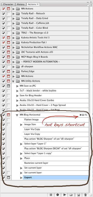
palette if you've got your Actions Palette view set to "Button Mode". When you click on the Create New Action icon, a dialog box will pop up asking you what you want to call your new action and which group of actions you want to save it into. You'll also have the option to create hot key short cuts for the action [highly recommended as a time saving tip] as well as an option to assign a color code to the action. Assigning a color code is particularly helpful for finding an action when you have a lot of them and you're working with your Actions Palette in Button Mode. In the example below, you can see that I called the new action "MN Blog Horizontal", I'm saving it to an exisitng set of actions i've created called "MN Utility Actions", I've assigned the hot key shortcut (on a Mac) as [command][shift][F1], and finally I've assigned a blue color label for it to go with the other MN Utility Actions that are also labeled blue. |
 |
||
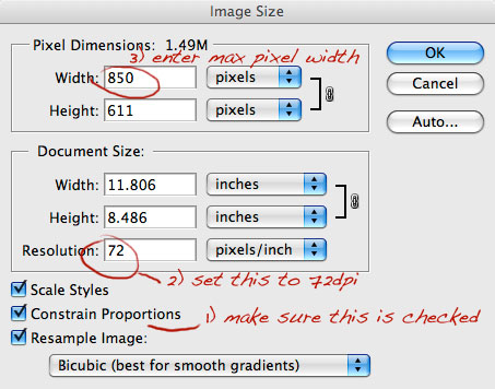
| Now just hit the "Record" button and you're on your way! IMPORTANT: Once you hit the magic record button, Photoshop records EVERYTHING you do, so make sure you follow the steps below carefully or you may end up with extra unnecessary or unwanted steps in your action. It's also important to hit the Stop Recording Action icon at the bottom of the actions palette when you're done because Photoshop keeps recording until you tell it to stop. I can't tel you how many times I've forgotten to do this. Step 4: Flatten the Image. Once you've done your final edits to the image, flatten the image to one layer by going to Layer > Flatten Image. NOTE: If you only have one layer in your iage file when you run theis action, Photoshop may give you a warning that teh Flatten Image comand is not currently available. Don't worry about it; just hit okay and let it continue running the action. Step 5: Resize the Image. Now you need to resize the image to the size you want to show it on your blog or website. To do this go to Image > Image Size or (on the Mac) press [command][option][I]. My blog currently displays images at a maximum width of 850 pixels, so that's what I use to set my image size to. NOTE: Make sure you have the "Constrain Proportions" option checked in the Image Size dialog box before you you change the width value of the image; this lets Photoshop set the height of the image at whatever pixel value it needs to be to maintain the aspect ratio of the image at the width value you enter. In the example below, with the image I'm working with I set the max width value to 850 pixels and PS determined the height needed to be 611 pixels. NOTE: Photoshop is a little picky on the order in which you set your values, and for some reason you need to change the resolution value first (if it's not already at 72dpi), before changing the width value. |
 |
||
| Click "OK" and your image will now be at the proper size for your blog
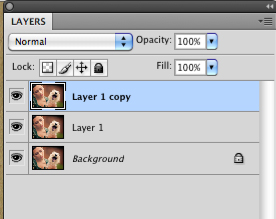
or website. Now you'll likely need to sharpen the image just a bit to get it all shiny and crisp for the web, but this is where my approach differs from others a bit. I wish all my images required the same level of sharpening to look their best once they've been resized, but unfortunately that's not the case. There are several variables that determine what kind of sharpening the final resized image needs, i.e. whether it's a close-up image vs one where the subject is further away, sharpness of the image straight out of camera, what kind of edits I did to the image at full size before resizing to the blog, etc. For that reason, I create 2 duplicate copy layers of the resized image and I apply different levels of sharpening to each. The top most layer gets heavier sharpening, the 2nd (middle) layer gets a more subtle level of sharpening and the bottom layer gets no sharpening. Then, I include a stop in the action that lets me adjust the layers of sharpening or turn them off before saving out the image. (That part will be covered later in a later step) The next few steps show how I creae these multiple levels of sharpening. Step 5: Create 2 duplicate layers of the resized, flattened image. At this point, the background layer should be highlighted, so all you need to do is (on the Mac) press [command][J] twice or go to Layer > Duplicate Layer twice to create those two copies. At this point, your layers palette should have 3 layers in it with the top most layer highlighted like the image below. |
 |
||
Step 6: Sharpen the top layer with your sharpening action of choice. This is the layer that gets the most amount of sharpening, typically the maximum amount of sharpening I would need fo ran image. I can't tell you how much you should add as this is a personal choice, and there are lots of different ways and just as many opnions about sharpening images for the web. Note, though, that you can adjust the level of opacity of this layer to lessen the intensity of the sharpening before saving out, so don't be afraid too afraid of over-doing it at this stage. For me, a year or two ago I stumbled onto Dustin Francis' website and an in depth article/review he wrote on sharpening actions, and I downloaded a set he had created. They rocked, and I've used them every since, but unfortunatley I don't know that they're available on his site anymore, which means I'm going to hate life for a couple days if I should ever have a catastrophic system failure and lose the actions (and my back-ups). There's lots of good choices out there, though, including some from Totally Rad and Kevin Kubota to list a few I know of. For this top layer, I used Dustin's "Blog Sharpen" action. Step 7: Select the middle layer and sharpen it with a more subtle layer of sharpening. Again, this will give you some quick flexibility later when running the action to adjust the level of sharpening you want to apply before saving. For this middle layer, I've used Dustin's "Blog Sharpen Decaf" action. Step 8: Select the top layer again. You'll want to select the top layer so that when we bring in the watermark in next it will be placed on it's own layer above the layer that's highlighted in the layers palette. I like the watermark to be located on top of the sharpened layers, and that's why I select the top most layer before the next step. Step 9: Place and resize the PNG watermark file you've already created. Now we'll use the "place" command in Photoshop to, well, place the watermark in the file and resize it and reposition it to however you want it to appear. To do this, go to File > Place..., and then point Photoshop to where the watermark file was saved to in Step 1. When the watermark is first placed into the image file, it may not be the correct size. BEFORE YOU HIT ENTER/RETURN to accept the size and location of the watermark, you can use the transform handles (the small squares you'll see in the corners and at the top, bottom, left and right sides of the watermark when it's first placed into the file) to resize it to the size you want it to be in your horizontal/landscape images, and then you can reposition it to a location you'd like it to default to. After you've got this the way you like it, THEN hit enter/return to accept the placement size and location. Photoshop will remember this size and location every time you run this action. Step 10: Rasterize the watermark layer. Photoshop places the initial watermark file as a smart object. Sometimes I want to be able to change the color of the watermark for better visibility before saving out the image for the blog, but you can't do a quick color fill of a smart object in Photoshop. To get around that, I rasterize the watermark layer so that it is now like any other regular Photoshop layer (no longer a smart object) which I can apply a quick color change to if I want to when I run the action. To rasterize the watermark layer, go to Layer > Rasterize > Smart Object, or you can just right click on the watermark layer in the Layers Palette and select the "Rasterize Layer" option. At this point, this is what my file looks like after I resized and repositioned the watermark layer during the initial placing process. I make the default watermark location in the center of the and around the lower third of the image. This is usually a good starting point for me, and although I move the logo around fairly often when I run this action, sometimes it works out where I just leave it in this position with no changes. The reason I don't position it higher in the image to start is because that's often where an important element in the image might be (like a face). |
 |
||
| Step 11: With the (now rasterized) watermark layer still highlighted
in the Layers Palatte, check the Preserve Transparancy icon. The reason for preserving the transparency is so that I can do a quick color change by filling the layer with a different color. If I didn't lock in the transparency of the watermark layer as part of this action, when I went to change the color doing a quick fill ([option][delete] fills with the current foreground color and [command][delete] fills with the current background color), the whole watermark layer would get filled with the new color rather than just the watermark. To preserve the transparency of the watermark layer, check the box next to the icon that looks like a mini checker board at the top of the layers palette. |
| Step 12: Lower the opacity of the watermark layer to 50%. This is a persoanl preference, but I do this so the watermark is semi-transparaent over top of the image. To me, in combination with the color I choose for the watermark when running this action, this keeps the watermark visible but maintains the focus on the image. To do this is use the opacity slider because for some reason for me PS won't register the opacity change step if you just type on a # change in the opacity value field. |
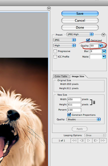
| That's petty much the meat of the action. The final step is to add save command. Step 13: Choose File > Save for Web & Devices (Mac shortcut = [comman][option][shift][S]) NOTE: If you're using CS2 or earlier, it may just say File > "Save for Web" In the following "Save for Web & Devices" dialog box, I tell Photoshop what settings I want to use to save the reformatted image. The important thing to note here is the quality (compression) setting of 60. The smaller this number is, the smaller the final file size will be and the faster it will load. The caveat is that if you compress the image too much, you're image may have a tiny file size and load really fast, but it will look pretty bad becuase you'd had to sacrifice a significant amount of pixel detail. A lot of people before me have done a lot of trial and error to see how much compression you can get away with and still get a great looking image, and that magic # seems to be 60. This gives you a pretty small file size without any perceptible loss in visual image quality. |
 |
||
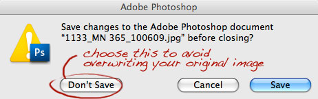
| Step 14 (Optional): Close the file. I leave this step out because I like to leave the newly formatted blog image open after the action's done running, but if you want you can choose File > Close ([command][W] on the Mac) and this will close the image after it's reformatted when you run the action. NOTE: Whenever you do close the file, whether as part of the action or at a later time, choose the "Don't Save" option in the dialog box that appears when you close the file. If you choose "Save", it will write over the original image file (the file you opened and/or edited before you ran the blog formatting action). |
 |
||
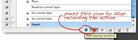
| Step 15: Stop recording the action. To stop recording, press the blue square stop icon at the bottom of the actions palette. |
 |
||
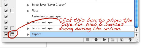
| Step 16: Toggle the dialog on for the "Export" step. This will cause the action to show the Save for Web & Device dialog box (from Step 13) giving you the option to rename the file or change the location it is saved to before saving it out when you run the action. The Tile Dialog On/Off box (off by default) for the "Export" step is located the to the left of the word "Export" and to the right of the check boc for this step in the Actions Palette. (see image below) |
 |
||
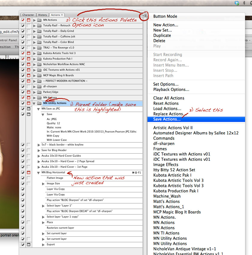
| Step 17: Save the actions set that the new action was created in. After I'm done with the action, I like to save the actions set that I created this new action in (in my case, "MN Utility Actions" from Step 3) just to make sure Photoshop updates the set to include this new action. To do this, make sure in the Actions Palette you first click on the parent folder for the actions set you created this new action in, and then click on the Actions Palette Options icon in the upper right hand corner of the Actions Palette and select the "Save Actions" option. See image below. |
 |
||
| Now in the resulting dialog box, just point Photoshop to the folder where that actions set resides. This should be located in Photoshop application folder > Presets > Actions. In my case, I've added a sub-folder in the Actions folder and called it "MN Actions", and that's where I save all the action sets I create so that I can find them easily and back them up easily. Step 18 (Optional): Restart Photoshop. I do this when I'm done so that Photoshop will keep this action set with my new blog formatting action open and available. If Photoshop happens to crash (Gasp! Photoshop crashes?! On a Mac!?) before I shut it down, it resets the Actions Palette to it's last known saved state. By Quitting PS and restarting it, I'm committing my Actions Palette layout to Photoshop's memory and every time it crashes or I restart it in the future, it will remember which action sets I had loaded and keep those settings until I manually close or turn off a set of actions. Capeche? If you did everything correctly, the steps in your new action should look something like this: |
 |
||
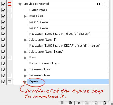
| Notes about running the action: To run the action, simply open up an image in Photoshop and edit it however you normally would (or just open a previously edited image), select your new action in the Actions Palette, hit the play button at the bottom of the Actions Palette (or use your shortcut hot keys if you assigned them or just click on the action if your Actions Palette is in Button Mode), then just sit back and watch the magic happen. Since you toggled on the Save for Web & Devices export dialog box, the action will pause at the dialog box. If you like the way everything looks, just hit save and you'll be done! If you want to change location or color or opacity of the watermark, or if you want to adjust the sharpness of the image first, just press [esc] on the keyboard or cancel out of the Save for Web & Devices dialog box. This will exit the action, but all you need to do after making any changes is use the Save for Web & Devices function again (File > Save for Web & Devices, or - on the Mac - [comman][option][shift][A]). You may be asking, "What if I want to change the location that Photoshop saves my blog formatted image to when - for example - I'm working on a new set of client images?" Good question; thanks for asking. Easy enough - I do this all the time. For each client session, I create a new folder called "[session date]_[client last name]_Blog Images". This is where I want PS to save the blog formatted images I create for that session. To do this, I open and edit the first image (if needed), make sure the Actions Palette is not in Button Mode so that I can see all the steps in the action, then play the action. When it gets the Save for Web & Devices dialog box, I escape or cancel out of that. At that point I go to the Actions Palette and double-click on the "Export" step which means I'm re-recording this step. This brings the Save for Web & Devices dialog box back up, and now when saving I point Photoshop to the new folder I created for the client's blog images. |
 |
||
| Finally, after you've done that, just go back and repeat Step 17 and click on the Parent Folder that your blog formatting action is located in inside the Actions Palette, and use the Save Actions option so that Photshop wil now save that action with the modified Export step. Now, every time you run that action it will continue to save the blog/web images in your new folder until you change it again in the future. "What if I want to run this action on a vertical/portrait orientation image?" Another good question... you get a star. There's ways to create an action that handles both landscape and portrait orientation images, but there's a downside I didn't like. In Step 5, instead of using the Image > Image Size command, you could instead use the "Fit To" command (File > Automate > Fit Too...) and just put in the maximum width and height your image can be (in my case, I would do 850 pixels in both the height and width boxes to make sure the images doesn't exceed that size). Using this command, Photoshop will maintain the aspect ratio of the image and resize the longest dimension to be 850px. Sounds good, right? Well, the downside is that I found the watermark size would be significantly smaller in portrait/vertical images than it is in landscape/horizontal images. I didn't want that, so I made a decision to create two different blog formatting actions using the steps above. If you want to make an action for vertical/portrait orientation blog images, just create a new action and use the same steps as above, except in Step 5, enter your maximum image height instead of width. |
| That's all she wrote! I know it may seem like a long and complicated process, but it's really not. It only takes a coupl eminutes to create this action, and it can save you tons of time in the future. As I mentioned before, I don't claim to have the market cornered in regards to having the best blog/website formatting action; this is simply what I do that works for me. If you've got a better action or ideas to improve this one, don't hesitate to leave a comment or shoot me an email (mail@mattnicolosi.com). Happy blog/website image formatting! |
| 113 |
Impromptu Vintage Camera Shoot
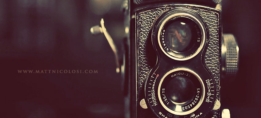
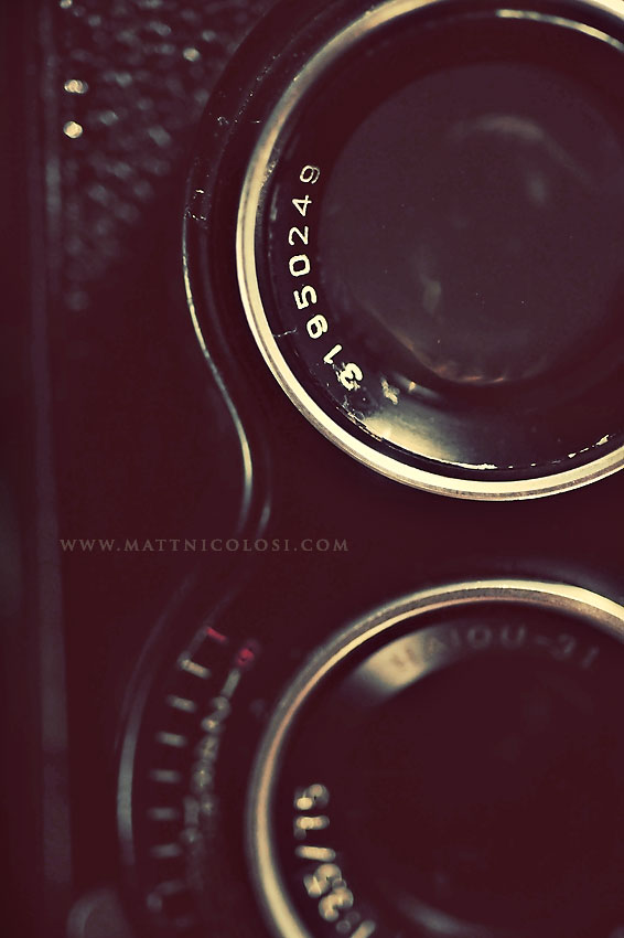
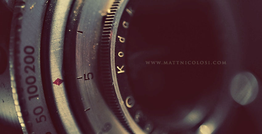
| It was 11:30pm... perfect time for an impromptu photo shoot. No people around, so I grabbed a vintage camera Kylie bought for me from my friend Robin for Christmas (I'm starting a little collection), turned on a small desk lamp, propped up a small silver reflector on a chair, cranked up the ISO on my Nikon D700 to 3200, and fired away for about 5 minutes. For any photographer-types out there who might stumble upon this and wonder, post-processing simply involved opening the images in Photochop, running Totally Rad Actions "Pool Party" & "Lux (soft)", and cropping. Voila... instant wall art. |
 |
||
 |
||
 |
||
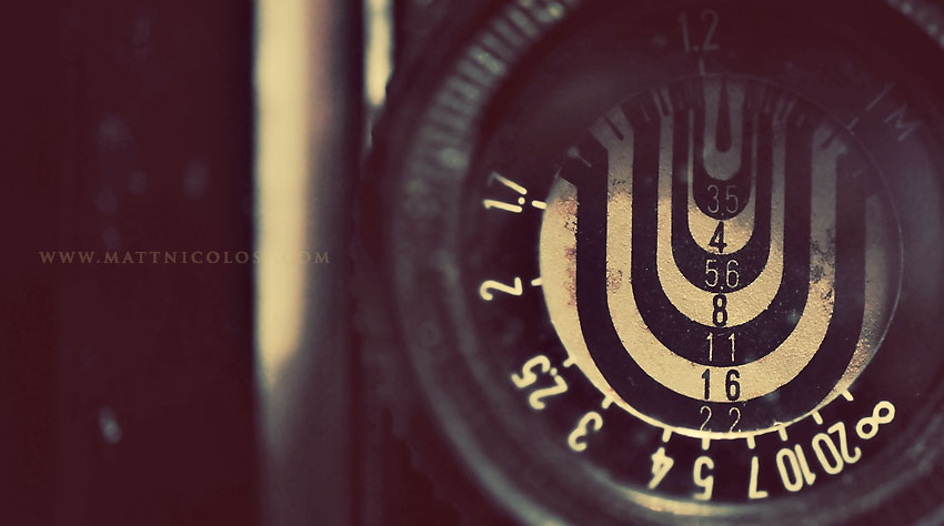
I'm always perplexed how camera makers settled on such odd sets of number combinations for apertures, f-stops and ISOs. It's a small miracle anybody ever figured out how to use one of these things. It's no wonder so many people today just flip their cameras to "A" mode for "Awesome" photos. |
 |
||
 |
||
 |
||
| 8 |
Remembrance Fine Art Albums
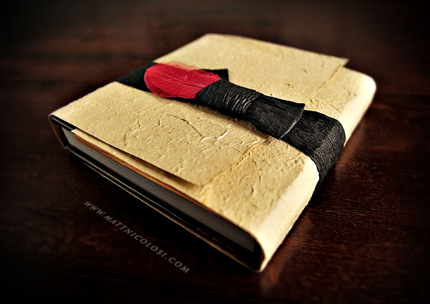
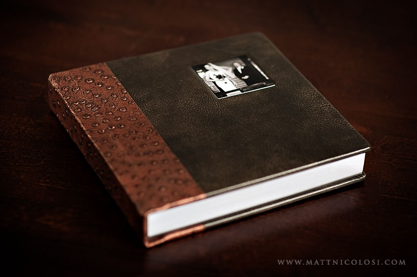
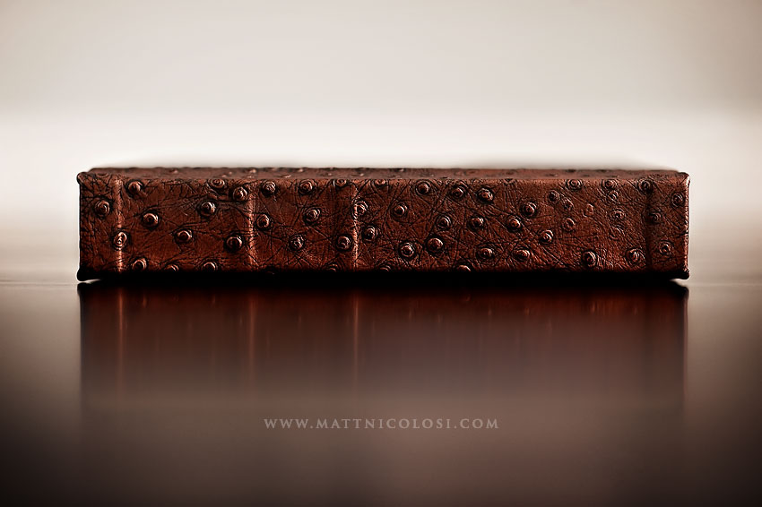
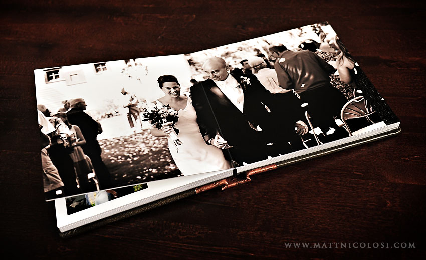
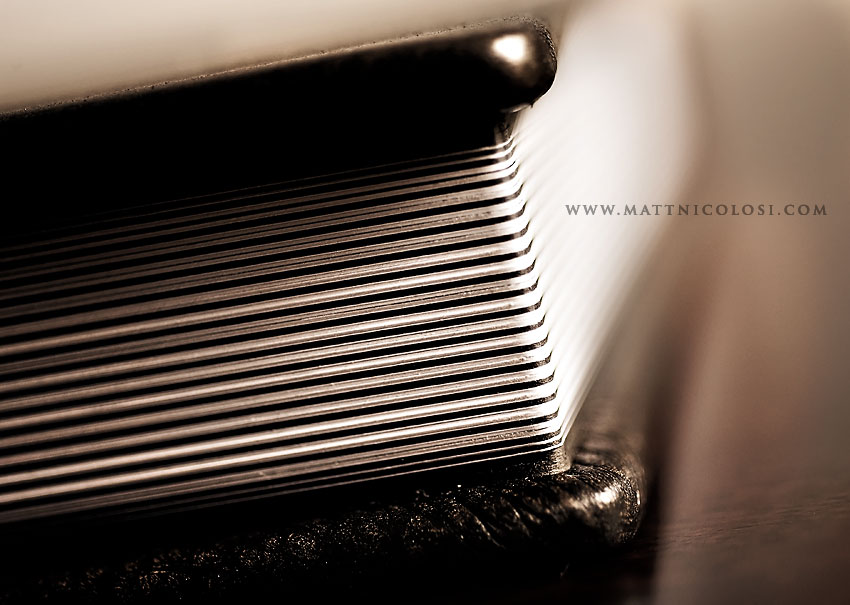
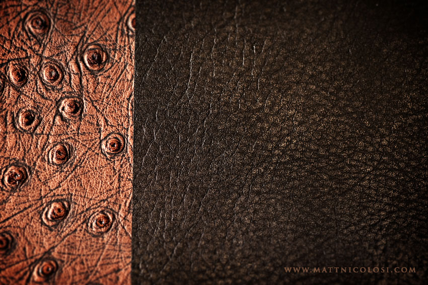
| One of my favorite ways to capture the story of my clients - whether it be a bride & groom, an afternoon with a family or a newborn's first year - is through a remembrance album. These are one of a kind, handmade fine art pieces that are truly a memoir to be handed down from generation to generation. The cover material options are amazing with more than enough combinations of styles and materials to create a statement that is both stunning and uniquely you. The 1/8" thick pages with full-bleed (edge-to-edge) printing lay flat for a seamless spread that showcases your breathtaking images in a clean, modern and timeless layout. And to top it off, your album is both protected and presented using beautiful sustainable materials like those shown below. |
 |
||
After shedding the presentation/protective jacket, revealed is a memoir that is as much a piece of art as it is a collection of your most precious memories. |
 |
||
 |
||
 |
||
 |
||
 |
||
 |
||
 |
||
 |
||
A closeup detail of the stunning cover materials. There are many options and combinations available to suit your design taste. |
 |
||
 |
||
| 6 |
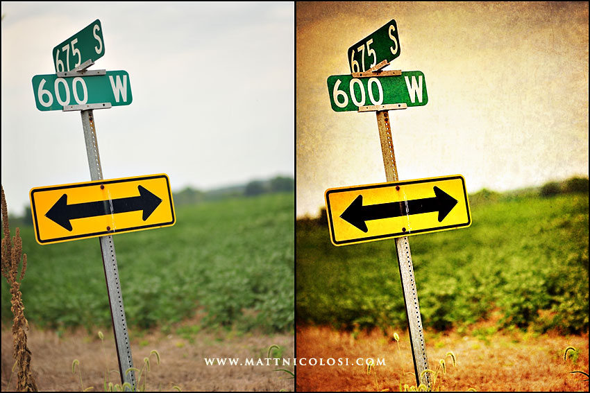
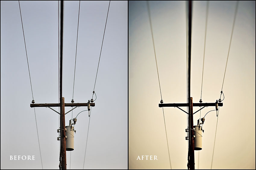
Image Polishing - Before and After
WHAT: Cityscapes & Landscapes, For Photographers, Useful Stuff, Tips, Tricks & Tutorials | WHEN: September 15, 2009
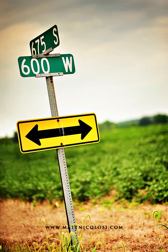
| It's been awhile since I posted a Before & After showing an example of how I add "polish" to images in Photochop. This installment uses a recent image from Indiana, and these county road signs actually have some significance; these signs mark the intersection where the house that my father-in-law Garry once was. While the house has not been standing on the lot for some years, the small workshop behind the house where Garry's father used to spend lots of time is still there, and these road signs probably bring back lots of memories for Garry and his brothers and sisters. In fact, Garry's brother Mick still owns the farm land across the road and Mick's daughter Jennifer and her husband Steve recently built a house on that land where they can look out their front window and see the land where their heritage lived for years. Kind of a cool story. In any case, let's get started with a quick before & after, shall we? |
 |
||
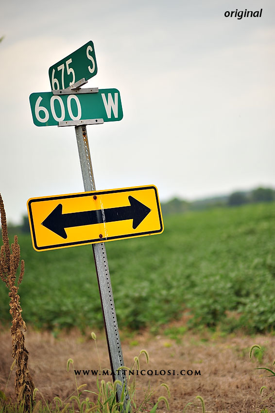
Here's the original image straight out of the camera. Not bad, but not very inspiring, eh? Whaddya say we polish it up a bit? |
 |
||
Step 1: - Totally Rad Actions (TRA) "Oh Snap" at 50% opacity |
 |
||
Step 2: - Kevin Kubota's "Tea Stain" at 40% opacity with the effect of this action masked in the sky area to maintain color & detail in sky. |
 |
||
Step 3: - TRA "Contrast" (80% opacity), sky masked to preserve color and detail - TRA "Clairify" (25% opacity), sky masked to preserve color and detail |
 |
||
Step 4: - Use clone and patch tools to remove ugly distracting plant to the left of the sign for cleaner overall image and better composition (looks like I missed a spot in the very lower left corner... oops.) |
 |
||
Step 5: - Added slight vignetting on edges - TRA "Warm It Up, Kris" (75% opacity) to add a tad more richness and, well, warmth to the feel of the image. |
 |
||
I could've stopped after step 5, but let's spiffy up this image just a little more. Who's with me? Step 6: Added the following textures from the Firenze Italian Texture Collection I photographed in Italy: - "Sweet Sistine" (80% opacity, soft light blend mode) - "Scarred Leonardo" (15% opacity, hard light blend mode) - "Watermark" (50% opacity, overlay blend mode, masked grass background to lessen texture in this area) |
 |
||
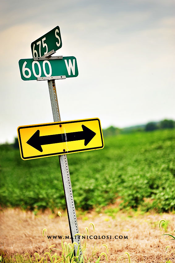
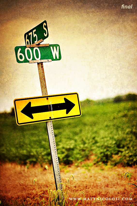
Step 7: - TRA "Old Skool Fast" (40% opacity, soft light blend mode). - Sharpening around the signs, sign post, and vegitation at the bottom of the image. |
 |
||
That's all for now. I'll post more before & afters ocassionally in future posts, so check back often. |
| 10 |
Image Polishing - Before and After
| Fairly frequently I get questions from other photographers asking about image post-processing. So, I'm gonna start occasionally occasionally mixing in a few posts where I describe some of my techniques and/or descriptions about how I lit, shot, and/or edited some images. Allow me to step on to my soapbox for just a second and say first and foremost that I'm an advocate for getting the best exposure you can in camera above all else. Let's face it, occasionally in an effort to capture a fleeting moment, we don't always get our settings just right in the camera, but if your bread and butter approach to photography is the FLIP method (Fix Later In Photochop), sooner or later someone is going to discover you in a sleep-deprived, editing-induced coma in a chair in front of your monitor... or you'll get burned out and quit. Photochop should not be used as a Band-Aid or crutch in place of getting to know how to use your equipment. I've been there and got the t-shirt, and it's no fun. Okay, I'm stepping off the soap box now. That being said, I certainly embrace digital tools like Photochop and Lightroom to add emphasis to my images. I heard this referred to today as "polishing images" from Ann Monteith, and I'm gonna shamelessy steal that phrase because I think it's right on the money. And with that in mind, here's my first "Image Polishing" mix: |
 |
||
| The Polishing Mix: 1. Totally Rad Actions Oh Snap (70% opacity) 2. Hue/Saturation adjustment layer, sample blue sky color with color picker and increase saturation 50% 3. Add vignetting (merge adjustments to new layer, change blend mode to multiply, and mask out center to taste) 4. Kevin Kubota's Actions Tea Stain (30% opacity) 5. TRA f/Zero, used gradient tool to create a mirror gradient on the resulting mask layer, then ran f/Zero Super HQ Conversion (gives added illusion of very shallow depth of field) 6. TRA Pool Party (50% opacity) 7. TRA Sparta (50% opacity) Keep in mind, this look oesn't work for every image. Also, I have many of these steps automated via combined actions to save me time. Total edit time was about 3 minutes. Until next time... |
| 15 |